Medication packaging is often treated as a simple container for a product. In reality, it functions as a critical interface between the medication and the person using it. For this project, I redesigned packaging for Benadryl with the goal of improving how users understand and interact with the medication.
Rather than focusing only on aesthetics, I approached the design as a small, guided experience that helps users quickly understand how to use the medication safely.
Background
Benadryl is a widely used over-the-counter allergy medication relied upon by both adults and children. Because it is easily accessible and frequently used, the packaging plays an important role in communicating dosage instructions, warnings, and ingredient information.
Traditional medication packaging often presents a large amount of information at once. While this ensures that details are available, it can make the most important information difficult to identify quickly.
For medications like antihistamines, misinterpreting dosage instructions or warnings can lead to serious consequences. The design challenge was therefore finding a way to present essential information clearly while supporting how people actually carry and use medication in daily life.
Challenge
The project focused on two core considerations: clarity of information and portability.
Users need to understand key details such as dosage, warnings, and ingredients quickly, especially when making purchasing decisions or administering medication to children. At the same time, many people carry medication with them throughout the day, which means the packaging must remain functional outside of its original retail environment.
Instead of treating the package as a static container, I approached it as a sequence of interactions that guide users through the information they need.
Process
The design began by separating the purchase decision from the usage experience.
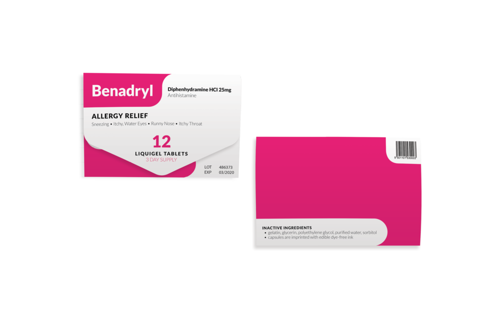
The outer packaging was simplified so that only the most essential information appears on the exterior. This includes the number of tablets, the symptoms the medication addresses, and the active ingredient. Presenting only this information allows users to quickly confirm that they are selecting the correct medication without being overwhelmed by additional details.
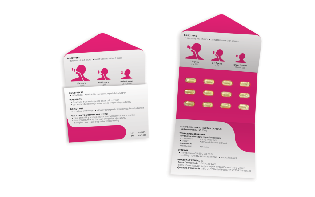
Once the package is opened, the internal layout introduces safety information and dosage instructions in a deliberate order. Warnings and directions appear first, using clear visual hierarchy and iconography to communicate age-specific dosing.
The pills remain attached to the packaging until they are individually removed. This approach allows users to retain dosage instructions and warnings while keeping track of the remaining medication. It also reduces the likelihood of misdosing, particularly when the medication is used by parents administering it to children.
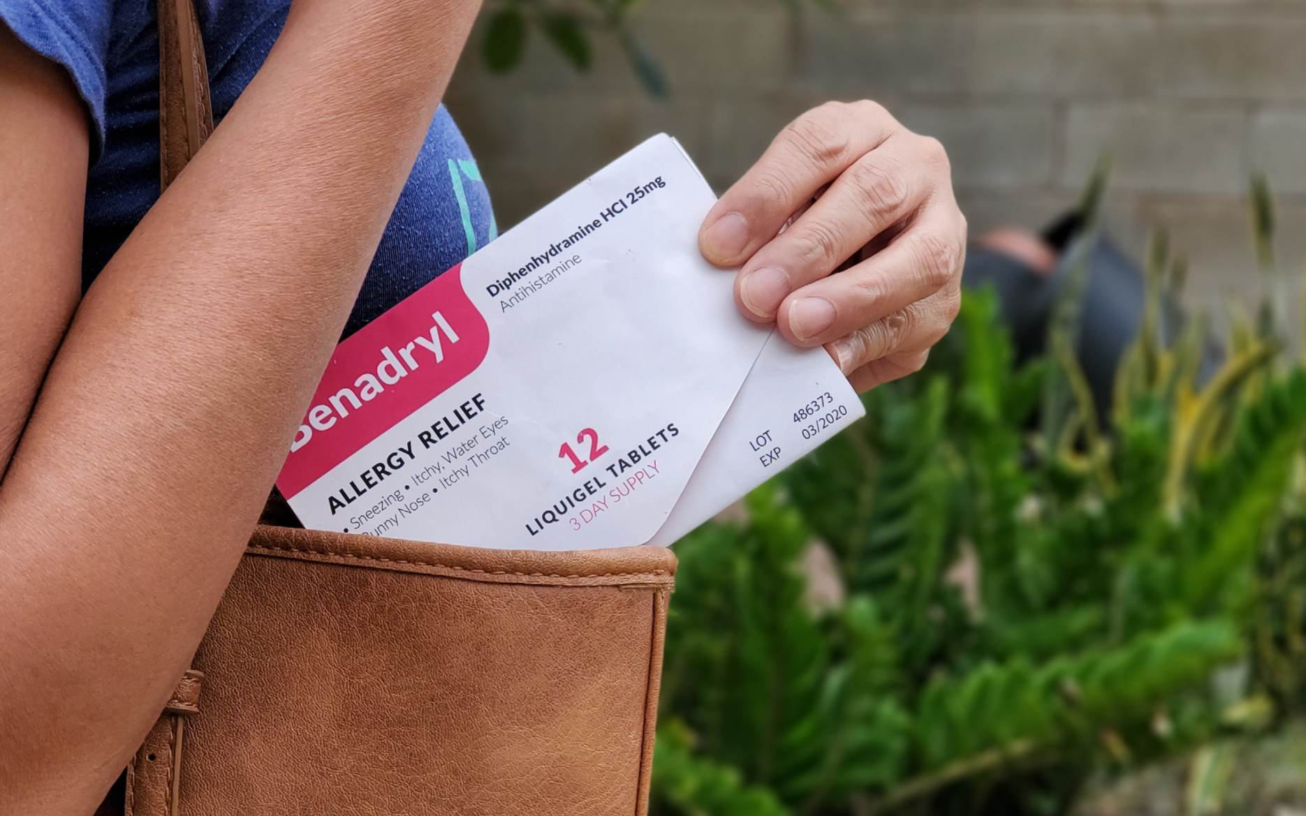
The resulting package is compact enough to fit into a wallet or bag while still preserving the full set of instructions needed for safe use.
Final Product
The final design reframes medication packaging as a guided interaction rather than a simple container.
Users encounter only the most important information when purchasing the product. Once the package is opened, instructions and warnings appear in a logical sequence that prioritizes safety and clarity.
The structure also allows users to carry the medication while retaining access to the information they need to use it correctly.
Impact & Insights
This project reinforced a design principle that continues to influence my work:
Even small products contain user experiences that can be improved through thoughtful sequencing and clarity.
By considering how people interact with medication beyond the moment of purchase, the packaging becomes part of a larger system that supports safe and informed use.