Designing for recurring events requires balancing two competing goals: familiarity and change. For the International Breast Density Workshop (IBDW), this challenge became clear when the conference moved from Hawaiʻi’s Big Island in 2023 to Kauaʻi in 2025.
As the program manager and designer for the conference, I was responsible for maintaining the recognizable identity of the event while adapting its visual language to reflect each host island. Rather than redesigning the conference each year, the goal was to create a system that allowed the visuals to evolve without losing the identity that returning attendees recognized.
Background
IBDW is an international workshop focused on breast density and breast cancer research. Its audience consists primarily of clinicians, researchers, and public health professionals who often return for multiple years.
Because of this, visual recognition matters. Attendees should immediately recognize the conference when registration opens or when new materials are released.
At the same time, the conference rotates between different islands in Hawaiʻi. Each location has a strong visual identity tied to its landscape and environment, and acknowledging that context helps the event feel connected to its setting rather than generic.
The design challenge therefore became balancing continuity with adaptation. The conference needed to feel consistent from year to year while still reflecting the character of each location.
Challenge
Early in the process, I separated the conference identity into two layers: structural elements that should remain stable, and visual elements that could evolve.
The structural layer included layout patterns, typography, and interface components used across the website and conference materials. These elements shape how attendees interact with the content, so maintaining consistency here ensures that the overall experience remains familiar.
The visual layer included logos, imagery, and color palettes. These elements offered an opportunity to reflect the host island while still fitting within the broader conference identity.
Accessibility also played a role in design decisions. Breast cancer awareness pink is closely associated with the subject of the workshop and needed to remain part of the palette. However, color combinations had to be adjusted carefully to maintain sufficient contrast against white and other interface elements.
Process
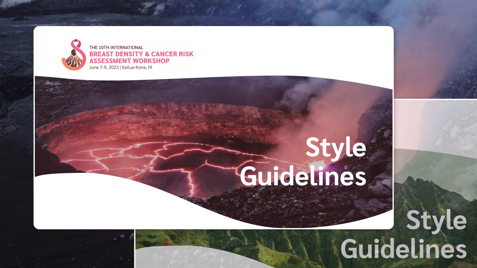
To support long-term consistency, I created a lightweight style guide documenting the structural components of the conference brand. The guide defined typography, layout grids, interface patterns, and spacing so that these elements remained stable across future iterations of the event.
With that framework established, I approached the visual design of each conference individually.
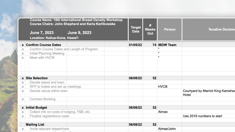
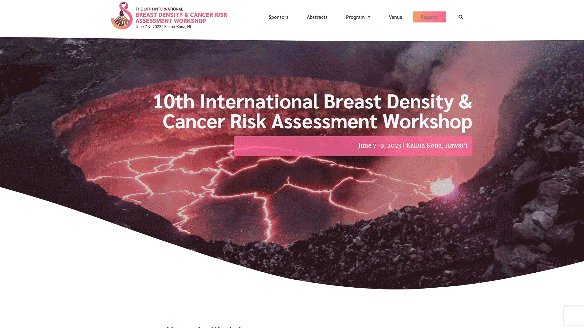
The 2023 conference on Hawaiʻi Island drew inspiration from the island’s volcanic landscape. The logo incorporated shapes influenced by Kīlauea, and the color palette emphasized warm pink, orange, and brown tones that echoed lava formations and surrounding terrain. Photography throughout the website reinforced the Big Island’s identity.
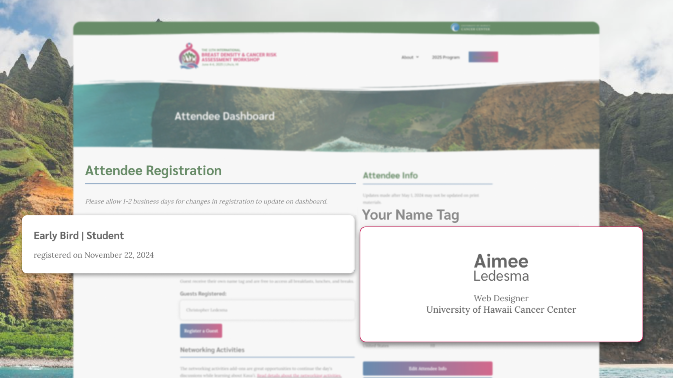
When the conference moved to Kauaʻi in 2025, the visual language shifted to reflect the island’s forests and coastal cliffs. The palette moved toward deep greens and blues, while imagery highlighted the Nā Pali coastline and Kauaʻi’s dense vegetation. Pink remained present to reference breast cancer awareness, but it was adjusted to ensure sufficient contrast within the new palette.
Although the visuals changed significantly between the two events, the layout structure and typographic hierarchy remained consistent. This allowed the conference to feel both familiar and contextually connected to its host location.
Final Product
The final result was a flexible conference identity that could adapt visually while remaining clearly recognizable.
When the materials from the two conferences are compared side by side, the differences in imagery and color clearly reflect the location of each event. At the same time, the shared layout system, typography, and interaction patterns make it clear that both belong to the same conference series.
Instead of redesigning the conference every year, the design system allows the identity to evolve in a controlled and intentional way.
Impact & Insights
One principle became particularly clear during this process:
Identity is defined as much by structure and experience as by visuals.
Because the underlying design system remained stable, the visual elements could evolve without breaking recognition. Returning attendees could immediately identify the conference, even though the imagery and color palette had changed.
This approach also simplified future planning. With a consistent framework in place, new visual directions can be explored without rethinking the entire design system each time the conference moves to a new location.